Two Approaches
Colour choice is crucial in a brand logo design, conveying the essence and message of your brand effectively. Adobe Illustrator empowers with potent colour tools for effective harnessing of colour potential in design. This blog post explores creating colour swatches and tints for the “My Terra” brand logo using two methods. The classic color sampling method and a streamlined technique involving transparency flattening. Mastering using Adobe Illustrator colour swatches and tints is a valuable tool to have mastered.
Method 1: Colour Swatches and Tints in Adobe Illustrator: The Classic Color Sampling Approach:
- Sample Colours: Begin by opening your “My Terra” logo in Adobe Illustrator. Use the Eyedropper tool to sample colours directly from different parts of your logo. This method is precise and allows you to select specific hues you want to incorporate into your swatches.
- Create Colour Swatches: Open the Swatches panel by navigating to “Window” > “Swatches.” With your colours selected using the Eyedropper tool, manually create new swatches by clicking on the “New Swatch” button in the Swatches panel. This approach offers fine control over naming and organising your swatches.
- Generate Tints: Once your swatches are created, you can manually adjust the tints by duplicating each swatch and modifying its brightness value.
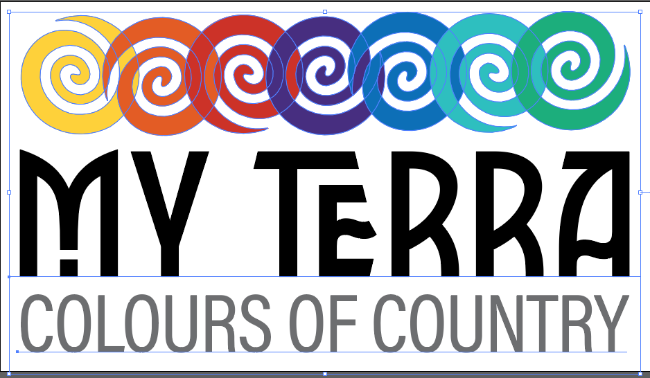
Image below – Completed logo “My Terra”.

Method 2: Colour Swatches and Tints in Adobe Illustrator: The Transparency Flattening Shortcut - The method I used
Flatten Transparencies: select the logo, then choose “Object” > “Flatten Transparency.” This process solidifies transparent elements. It rasterises them, converting to solid shapes.
I used the transparency flatten method as I had so many options of colours as my logo icon’s were going to be left at 70%. I also wanted to be able to use other percentages of the original “My Terra” colours that I had selected to use.

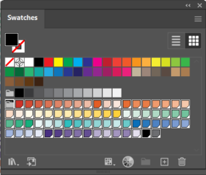
Create Colour Swatches Automatically: With your flattened design still selected, open the Swatches panel (“Window” > “Swatches”). Click on the “New Colour Group” button (folder icon) in the Swatches panel. Illustrator will automatically generate a new colour group containing swatches of all the colours used in your logo, including any transparencies that were flattened. Image Below – “My Terra” colour palette.

Organize and Name: Similar to the first method, you can double-click on each swatch in the colour group to rename and organize them for easy identification.
Using Your Swatches and Tints
Both methods lead to a collection of swatches and tints that can be used consistently across your designs. Here’s how to incorporate them into your projects:
Apply Swatches: Utilise the swatches you’ve created by selecting elements in your design and clicking on the desired swatch in the Swatches panel. This instantaneously changes the fill or stroke colour of the selected objects.
Experiment with Tints: To add depth and dimension to your designs, try applying tints to various design elements. Experiment with lighter tints for objects that should appear softer or closer, creating a visually appealing hierarchy.
To Save Palette: To save a colour palette from Adobe Illustrator on your computer, simply go to the Swatches panel, click on the options menu, and choose ‘Save Swatch Library as ASE’ (Adobe Swatch ExchangeFile). This will allow you to access and use the palette in future design projects.
In conclusion Adobe Illustrator gives you multiple ways to create colour swatches and tints from your brand logo. Whether you prefer the classic colour sampling method or the time-saving transparency flattening technique, both approaches lead to a consistent and visually appealing colour palette that embodies your brand’s identity. By mastering these methods, you’ll unlock the potential to create designs that resonate with your audience and leave a lasting impact.
PROFESSIONAL EXPERIENCE
I personally chose the transparency flattening method because of the extensive colour palette I had to work with in my “My Terra” logo.
I needed a quicker and more time-efficient way to select colours while ensuring I could use various percentages of the original “My Terra” colors. However, it’s always valuable to be familiar with alternative methods to adapt to different design scenarios.
Also, by saving the colour palette as a ASE file, I could also add this to a client branding packing.
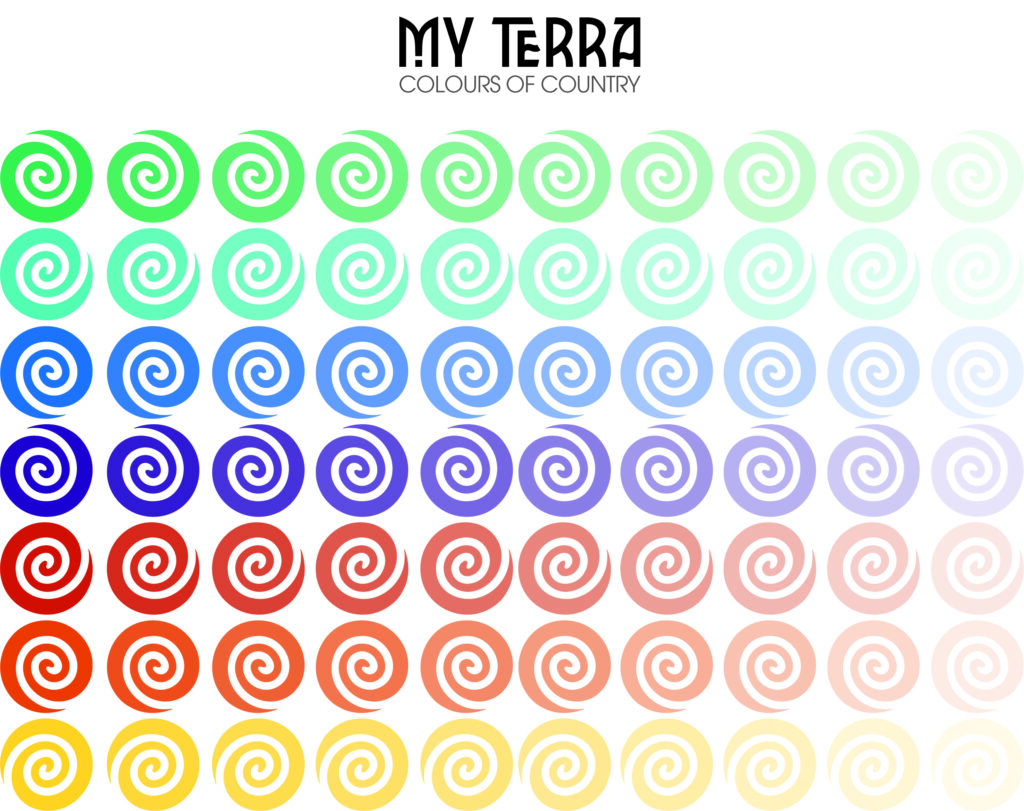
Header Image – Colour palette from the “My Terra” Style Guide.
